
Shopify, custom-built · Womenswear
Loving This Dress
From WooCommerce to Shopify, with gift cards recreated under the same codes and a theme designed twice: one version for desktop and one for mobile.
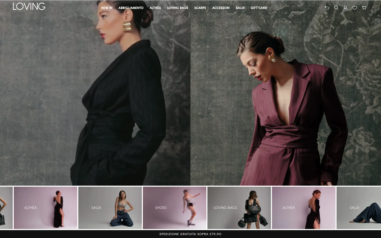
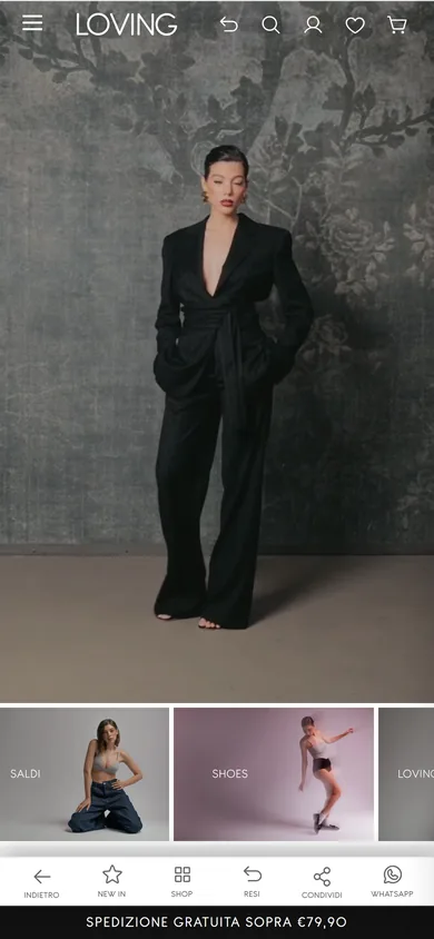
For a fashion shop whose customers are used to gift cards and points, changing platform touches the very thing trust rests on: the balances and points customers already have in their pockets. That’s where the work started, and it ended with a theme that has one layout for mobile and another for desktop.
What we built
- A carefully reasoned migration. Products, collections, pages, menus, customers and gift cards moved from WooCommerce to Shopify through dedicated scripts. Composition, fit and line became fields on the product page.
- Gift cards and points, with nothing lost. Gift cards already issued were recreated with the same code and the remaining balance. The points scheme carries over the rules of the previous one through eShoopy Loyalty: the app belongs to our partner eShoopy, and we set it up together with them.
- Two experiences, one for each screen. Many shops are designed for desktop and shrink into a narrow page on a phone. Others are born for the phone and look like a stretched app on a computer. Here each screen has its own layout: the opening section, menu and navigation change shape between desktop and mobile, and each can be updated without touching the other.
- A product page designed for the thumb. On mobile, the information you need to decide stays under your thumb as you scroll, and colours are picked right below the photos, with a preview of the garment when you hold your finger on a colour. On desktop the page opens in two columns, with the photos on one side and the information on the other.
- Colour first, then size. The theme’s guided selection has shoppers choose the colour while looking at the photos, and only then the size. Sold-out combinations are already marked and a summary wraps up the choice before the basket. On mobile it fills the whole screen.
- Filters and a bottom bar. On desktop the filters sit above the grid; on mobile they open full screen. A fixed bar at the bottom, on mobile only, leads to the most-used sections and is configured from the theme settings.
- A custom theme. Home page, collections, search, basket and product page are designed and written by us for Loving This Dress. The checkout carries the brand’s look too.
- Tools for shoppers and for the shop team. Size guide, model details, wishlist, back-in-stock alerts, payment in three instalments and cash on delivery. Customers sign in with a code sent by email. Reviews and a user manual built into the theme complete the set.
What we add
We started with the part customers don’t see. Every gift card already issued was recreated with its code and its balance, and the points scheme follows the same rules as before: anyone who had credit finds exactly the same amount on the new platform.
When it makes sense. If you’ve been selling online for years and need to change platform, you start from what your customers already have: balances, points and habits. Today people buy mostly on their phones, so the shop should be designed there first, without treating the desktop as an afterthought.
More case studies.
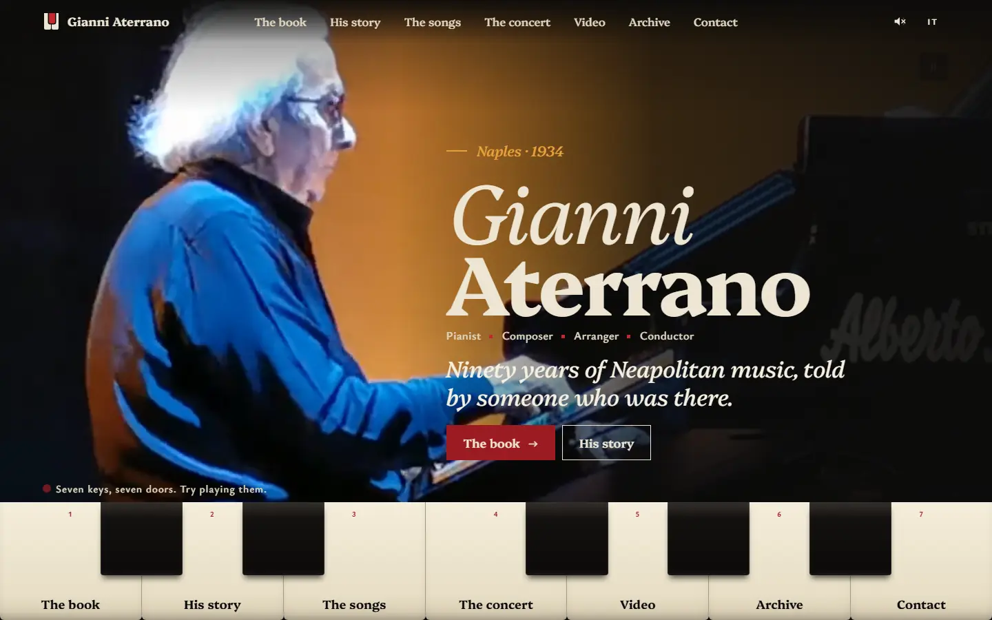

Maestro Gianni Aterrano
gianniaterrano.itThe official website of a master of Neapolitan song: the menu is a keyboard you can play, and the concert at Teatro Diana lives on in twenty-five videos.
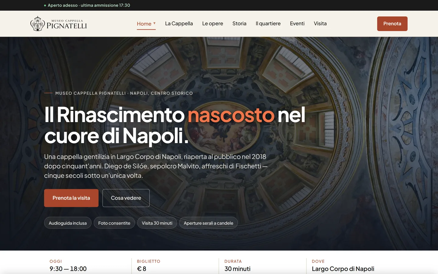
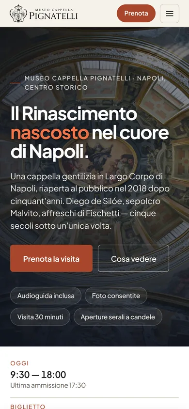
Museo Cappella Pignatelli
museopignatelli.itFrom logo to ticketing: identity, an editorial website and BeezWoo Tickets, with one QR code for the whole booking and an entry gate that works offline.
Have a similar project in mind?
Tell us what you sell or what the website needs to do, and where you're starting from: current platform, catalogue, management software. We'll reply with the questions we need to understand the job.
Or email us at [email protected]
 Tools, not shop windows
On a computer?
Scan the code with your phone and message us on WhatsApp.