
WordPress, custom-built · Medical website
Prof. Giovanni Dell’Aversana Orabona
The website of a university surgeon: ten areas of treatment explained, the 3D method shown in three steps and appointments booked online or on WhatsApp.
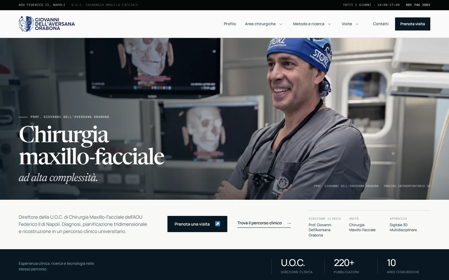
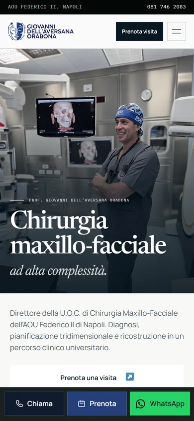
A university maxillofacial surgeon needs a website that explains clearly what he treats and how to book an appointment, along with an identity distinct from that of the scientific society. We designed the logo and identity and built the website.
What we built
- Logo and visual identity. Logo, colours and typefaces designed for the surgeon, with clinical photography in the foreground and alternating dark and light sections: an identity distinct from that of the scientific society.
- Ten areas, ten pages. Each surgical area has its own page, linked to the profile, method and research, publications, appointments and contact details.
- The 3D method in three steps. A section shows the surgeon’s digital workflow: 3D diagnosis, virtual simulation and verification in the operating theatre.
- Clear clinical pathways. We removed an old questionnaire that suggested a pathway based on symptoms. The site presents the clinical pathways and refers visitors to a specialist consultation.
- Booking in one tap. Online booking is prominent throughout the site, and on mobile a fixed bar keeps three actions within thumb’s reach: phone, booking and WhatsApp.
- Structured data for Google and AI assistants. Doctor, clinic, ten procedures and breadcrumb trail described with Schema.org. Each area page states the procedure and who performs it.
- A form that protects data. The form is for organisational requests and asks people not to send medical reports or images. On top of that: self-hosted fonts, a spam filter and security headers.
What we add
The boldest choice was removing the old symptom questionnaire. A medical website shouldn’t look like a diagnosis: anyone with a concern finds the clinical pathways and books a consultation with the specialist.
When it makes sense. If you work in a healthcare profession, you need a website that informs with restraint and is easy to find.
More case studies.
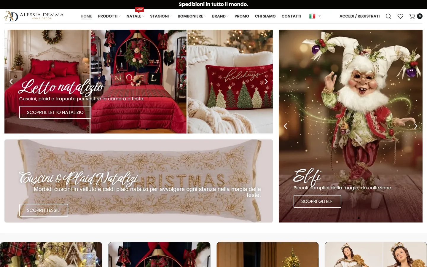
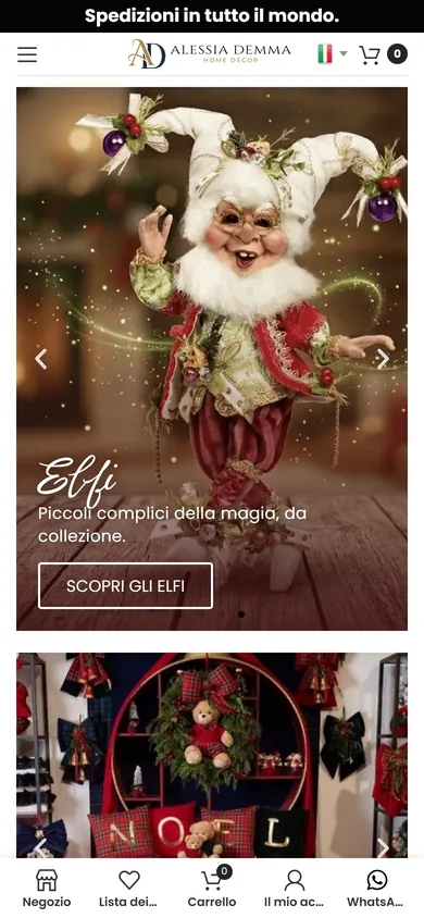
Alessia Demma
alessiademma.itLogo, identity and a homeware and gift shop: favours put together piece by piece, a gallery for every screen and a search that understands the catalogue.
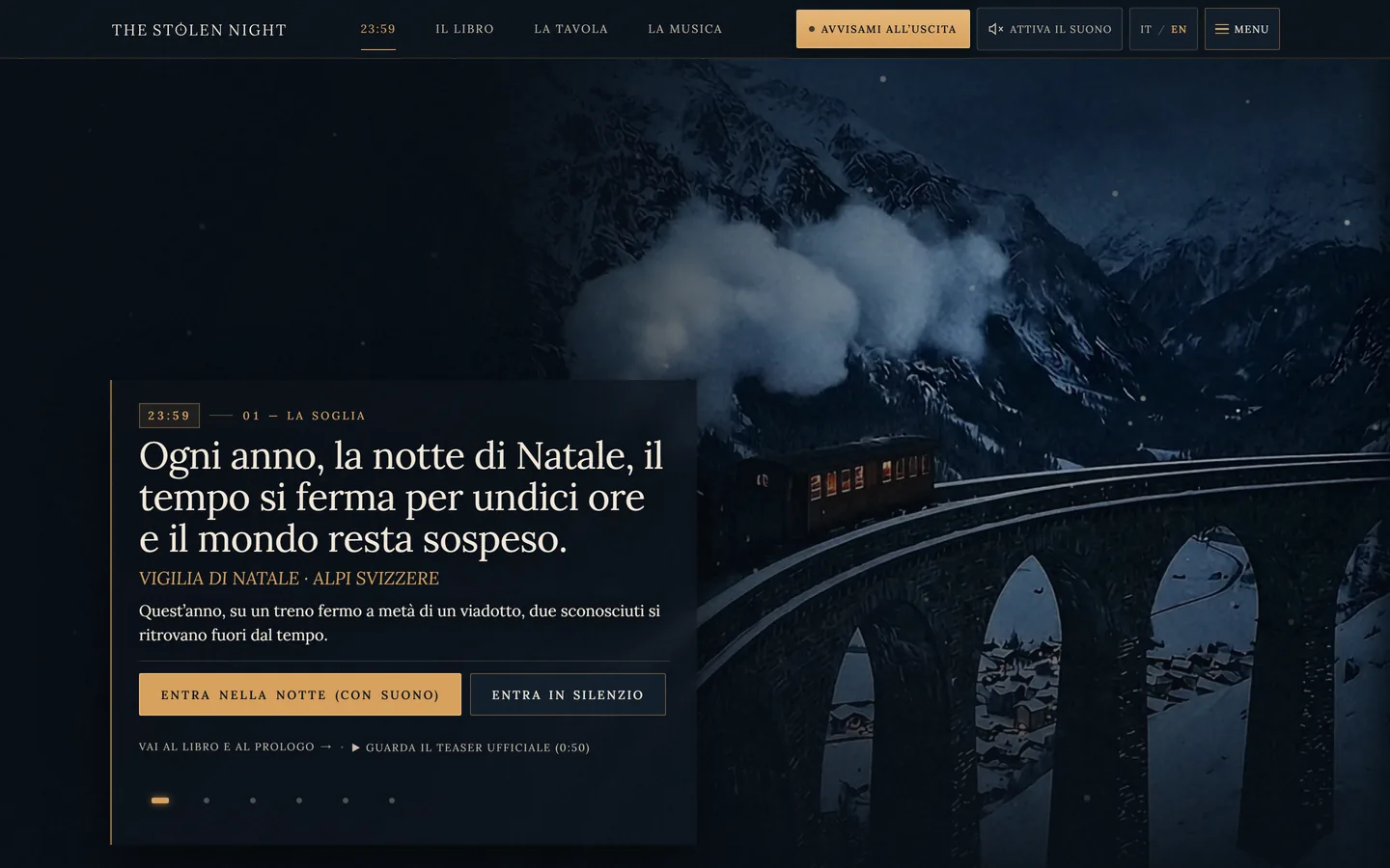
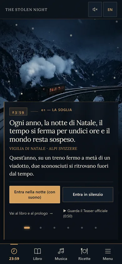
The Stolen Night
thestolennight.comFor GianMaria Aterrano's novel: identity, thirty-eight plates, eight original tracks, a trailer, a bilingual book and a site like a suspended night.
Have a similar project in mind?
Tell us what you sell or what the website needs to do, and where you're starting from: current platform, catalogue, management software. We'll reply with the questions we need to understand the job.
Or email us at [email protected]
 Tools, not shop windows
On a computer?
Scan the code with your phone and message us on WhatsApp.